React Bootstrap Skins
React Skins - Bootstrap 4 & Material Design
Note: This documentation is for an older version of Bootstrap (v.4). A
newer version is available for Bootstrap 5. We recommend migrating to the latest version of our product - Material Design for
Bootstrap 5.
Go to docs v.5
React Bootstrap skins are basic color schemes which can be applied for the website providing ready to use full-page web design.
MDB provides you with few basic color skins schemes you might consider applying on your website for a different effect.
To apply a skin you just need to add one of our skin classes to the <body> element.
Skin affects the following elements: navbar, sideNav, footer, button,
dropdown, pagination, input, controls of carousel-multi-item,
form-header, card-header, spinners, pagination, gradients,
primary, secondary, default colors.
White skin MDB Pro component
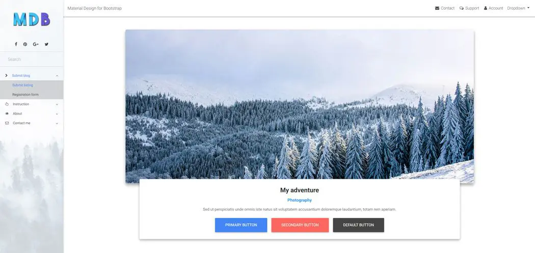
<body class="white-skin">
Black skin MDB Pro component
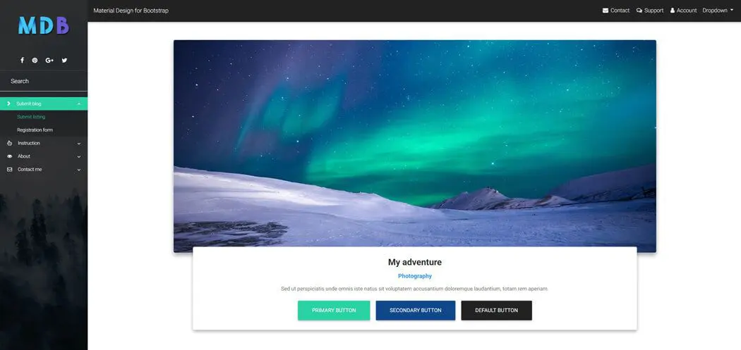
<body class="black-skin">
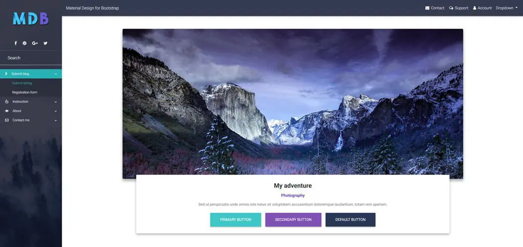
Cyan skin MDB Pro component
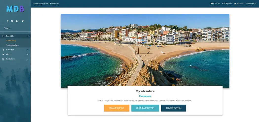
<body class="cyan-skin">
MDB skin MDB Pro component
<body class="mdb-skin">
Deep purple skin MDB Pro component
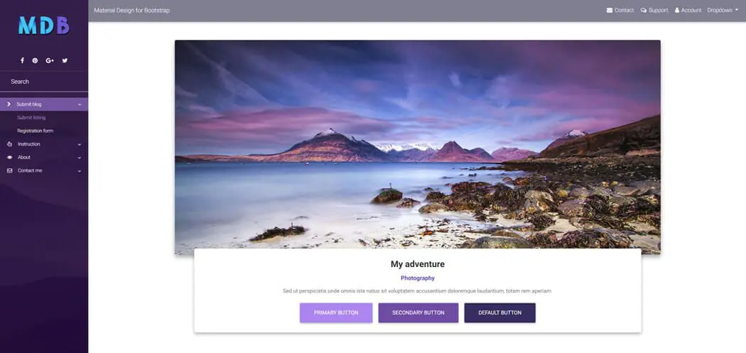
<body class="deep-purple-skin">
Navy blue skin MDB Pro component
<body class="navy-blue-skin">
Pink skin MDB Pro component
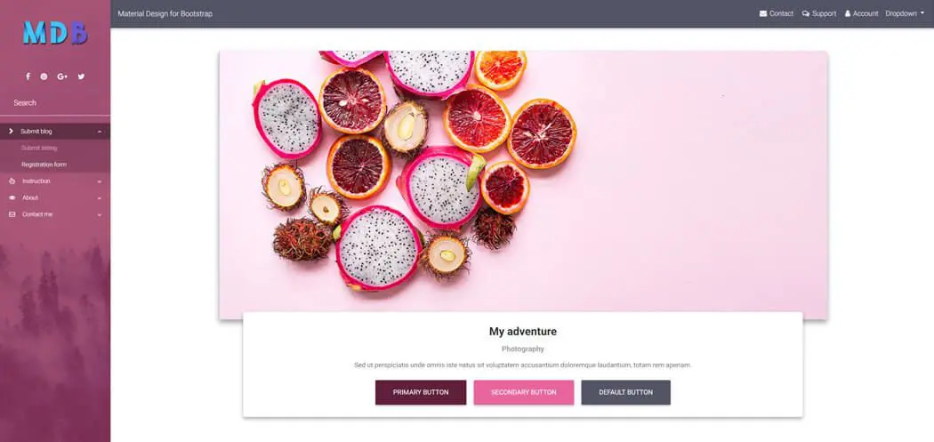
<body class="pink-skin">
Indigo skin MDB Pro component

<body class="indigo-skin">
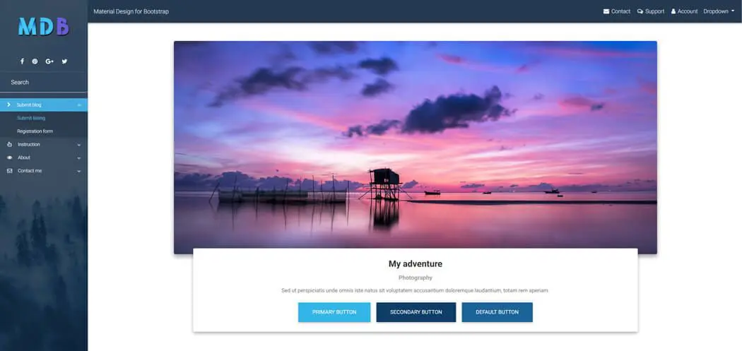
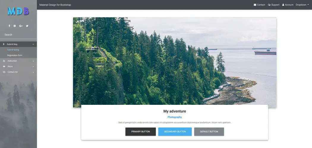
Light blue skin MDB Pro component

<body class="light-blue-skin">
Grey skin MDB Pro component
<body class="grey-skin">