Angular Bootstrap Skins
Angular Skins - Bootstrap 4 & Material Design
Note: We are transitioning MDB4 to a legacy version and focusing on developing MDB5.
While we'll continue to support for the transition period, we encourage you to migrate to
MDB5. We're offering a 50% discount on MDB5 PRO to help with your transition,
enabling you to leverage the full potential of the latest version. You can find more information here.
get 50% discount on MDB5 PRO
Angular Bootstrap skins are basic color schemes which can be applied for the website providing ready to use full-page web design.
MDB provides you with few basic color skins schemes you might consider applying on your website for a different effect.
To apply a skin you just need to add one of our skin classes to the <body> element.
Skin affects the following elements: navbar, sideNav, footer, button,
dropdown, pagination, input, controls of carousel-multi-item,
form-header, card-header, spinners, pagination, gradients,
primary, secondary, default colors.
White skin MDB Pro component
<body class="white-skin">
Black skin MDB Pro component
<body class="black-skin">
Cyan skin MDB Pro component
<body class="cyan-skin">
MDB skin MDB Pro component
<body class="mdb-skin">
Deep purple skin MDB Pro component
<body class="deep-purple-skin">
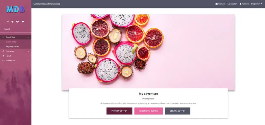
Pink skin MDB Pro component
<body class="pink-skin">
Indigo skin MDB Pro component
<body class="indigo-skin">
Light blue skin MDB Pro component
<body class="light-blue-skin">
Grey skin MDB Pro component
<body class="grey-skin">
Add custom skin MDB Pro component
Open your global stylesheet styles.scss, and add there a markup for your brand new skin.
After the new skin markup, add necessary imports from ng-uikit-pro-standard folder in node_modules
directory.
          $skins: () !default;
          $skins: map-merge((
            "test": (
              "skin-primary-color": #fff,
              "skin-navbar": #fff,
              "skin-footer-color": #fff,
              "skin-accent": #fff,
              "skin-flat": #fff,
              "skin-sidenav-item": #fff,
              "skin-sidenav-item-hover": #fff,
              "skin-gradient-start": #fff,
              "skin-gradient-end": #fff,
              "skin-mask-slight": #fff,
              "skin-mask-light": #fff,
              "skin-mask-strong": #fff,
              "skin-sn-child": #fff,
              "skin-btn-primary": #fff,
              "skin-btn-secondary": #fff,
              "skin-btn-default": #fff,
              "skin-text": #fff
            )
          ), $skins);
          @import '~ng-uikit-pro-standard/assets/scss/core/mixins';
          @import '~ng-uikit-pro-standard/assets/scss/core/colors';
          @import '~ng-uikit-pro-standard/assets/scss/core/variables';
          @import '~ng-uikit-pro-standard/assets/scss/core/variables-pro';
          @import '~ng-uikit-pro-standard/assets/scss/core/msc/skins-pro';
Important note: Please note, that "test" is name of your skin.
After saving styles.scss file, open index.html file and add class test-skin to body element.
Add new data to skin object MDB Pro component
Open your global stylesheet styles.scss, and add there a markup for your brand new skin.
After the new skin markup, add necessary imports from ng-uikit-pro-standard folder in node_modules
directory.
            @import '~ng-uikit-pro-standard/assets/scss/core/mixins';
            @import '~ng-uikit-pro-standard/assets/scss/core/colors';
            @import '~ng-uikit-pro-standard/assets/scss/core/variables';
            @import '~ng-uikit-pro-standard/assets/scss/core/variables-pro';
            @import '~ng-uikit-pro-standard/assets/scss/core/msc/skins-pro';

            @each $skin, $data in $skins {
              .#{$skin}-skin {
                .custom-class {
                  background-color: map-get($data, skin-primary-color) !important;
                }
              }
            }


